Project Overview
The Project
Upriver Landing, an upcoming restaurant in Chilliwack, BC, is transforming a historic residential landmark into a vibrant dining space. They approached us with a deeply thoughtful, historical concept and a raw structural blueprint. Their goal was clear: create a visual identity that acts as a bridge between the region’s rich physical geography and its 1860s township roots.
The Strategy & Collaboration
Great design thrives on great partnerships. Rather than starting from scratch, we honored the client's creative direction by taking their comprehensive logo blueprint and polishing it into a functional, scalable, and market-ready brand asset. Our design intervention focused on three core pillars:
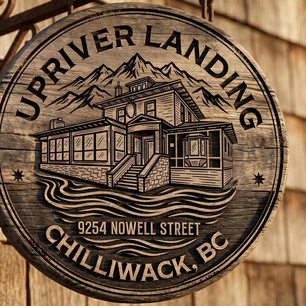
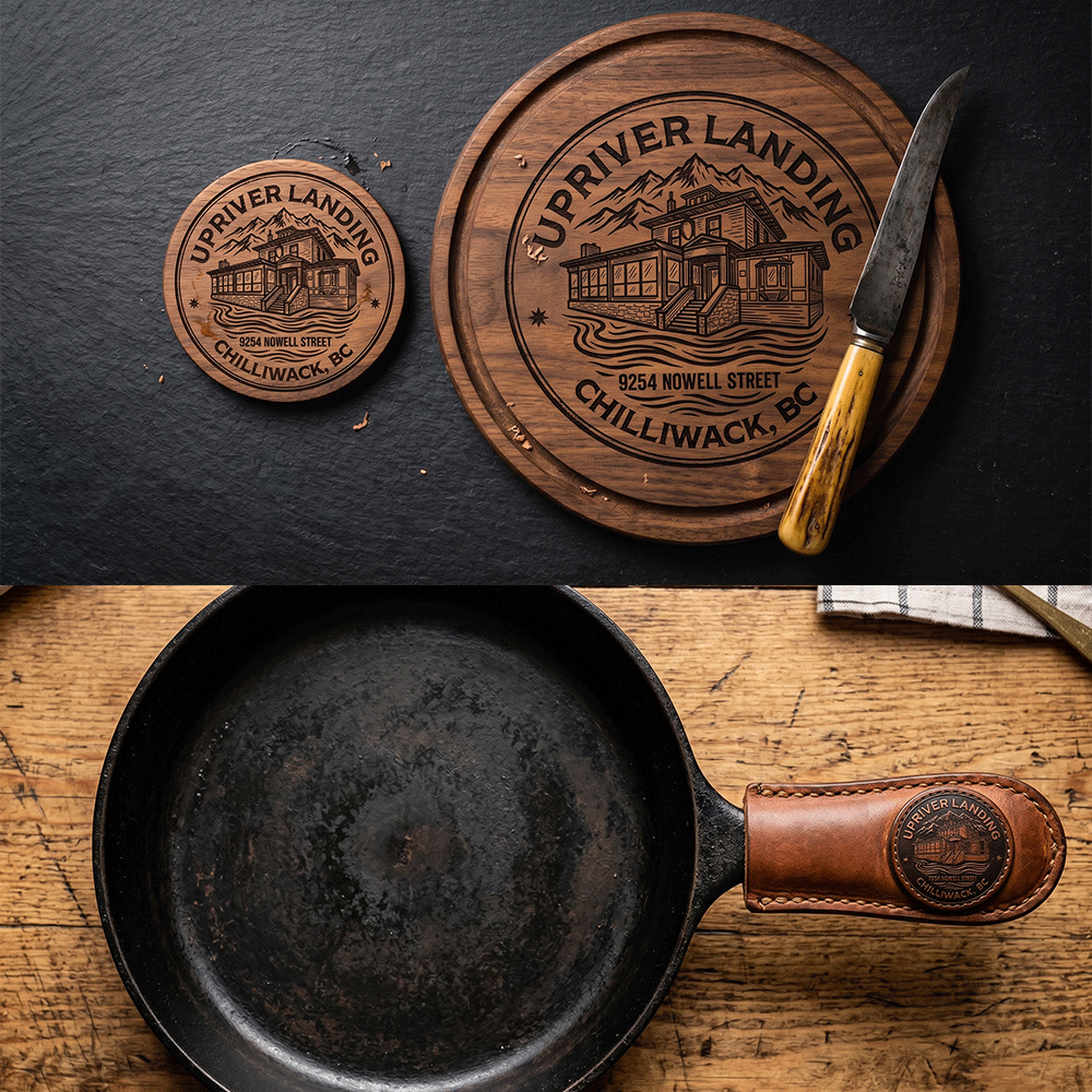
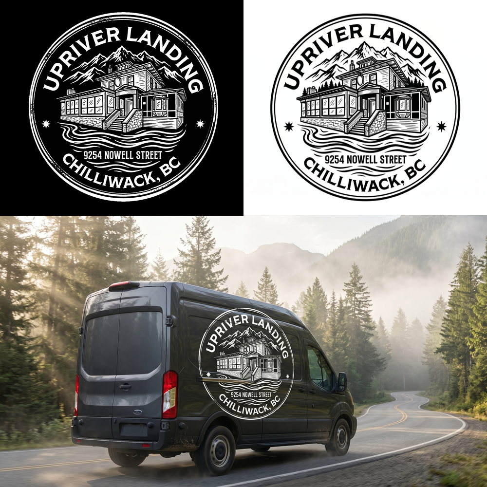
The Landmark: We meticulously refined and polished the client’s vintage-style illustration of the actual historic building being converted for the restaurant.
The Geography: We elevated the surrounding mountain and flowing water elements, honoring the majestic Fraser River and celebrating the unceded territory of the community.
The Typography & Frame: We finalized a distressed, circular badge style—a deliberate nod to the historic 1860s Chilliwack Landing and early township incorporation.
The Outcome
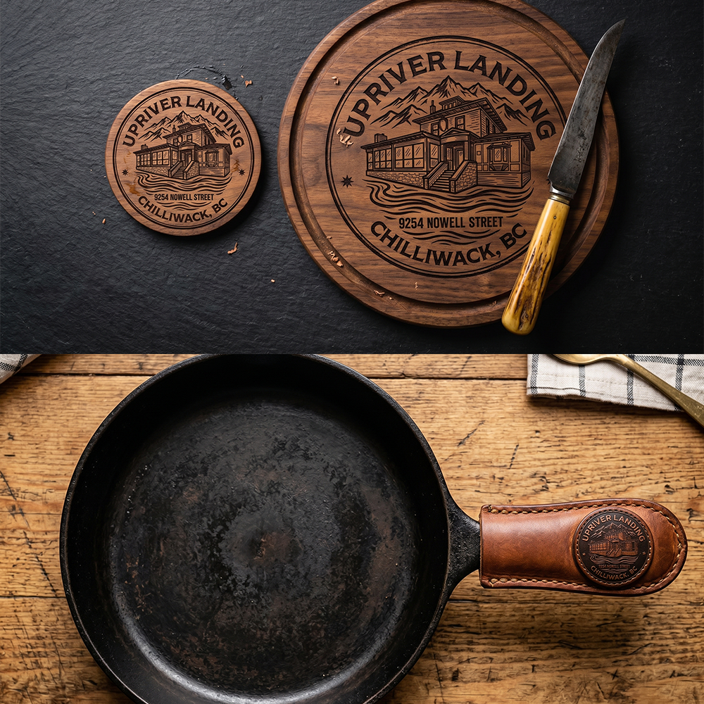
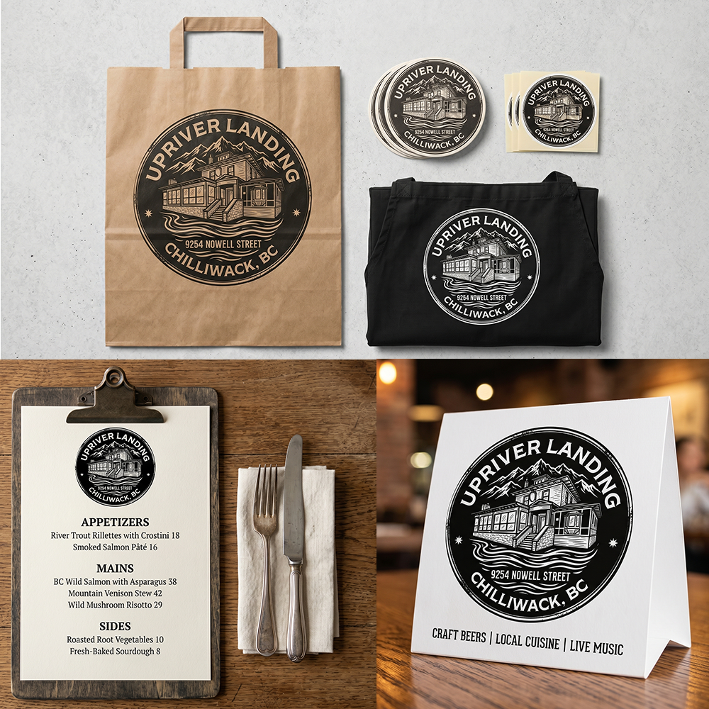
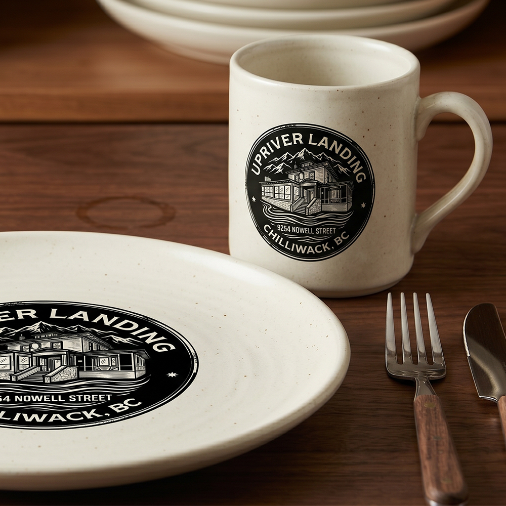
We successfully took a complex, deeply personal client blueprint and optimized it for the modern market without losing its historical soul. The result is a versatile, high-contrast circular badge that scales beautifully across signage, menus, digital platforms, and apparel—ready to welcome diners to a piece of living history.
Upriver Landing, an upcoming restaurant in Chilliwack, BC, is transforming a historic residential landmark into a vibrant dining space. They approached us with a deeply thoughtful, historical concept and a raw structural blueprint. Their goal was clear: create a visual identity that acts as a bridge between the region’s rich physical geography and its 1860s township roots.
The Strategy & Collaboration
Great design thrives on great partnerships. Rather than starting from scratch, we honored the client's creative direction by taking their comprehensive logo blueprint and polishing it into a functional, scalable, and market-ready brand asset. Our design intervention focused on three core pillars:
The Landmark: We meticulously refined and polished the client’s vintage-style illustration of the actual historic building being converted for the restaurant.
The Geography: We elevated the surrounding mountain and flowing water elements, honoring the majestic Fraser River and celebrating the unceded territory of the community.
The Typography & Frame: We finalized a distressed, circular badge style—a deliberate nod to the historic 1860s Chilliwack Landing and early township incorporation.
The Outcome
We successfully took a complex, deeply personal client blueprint and optimized it for the modern market without losing its historical soul. The result is a versatile, high-contrast circular badge that scales beautifully across signage, menus, digital platforms, and apparel—ready to welcome diners to a piece of living history.
The Work
Visual showcase of our technical execution.